Sales teams miss targets because they see problems too late. I’d fix that with one KPI dashboard that tracks 8–12 KPIs across leads, pipeline, forecasts, and rep output.
Here’s the short version:
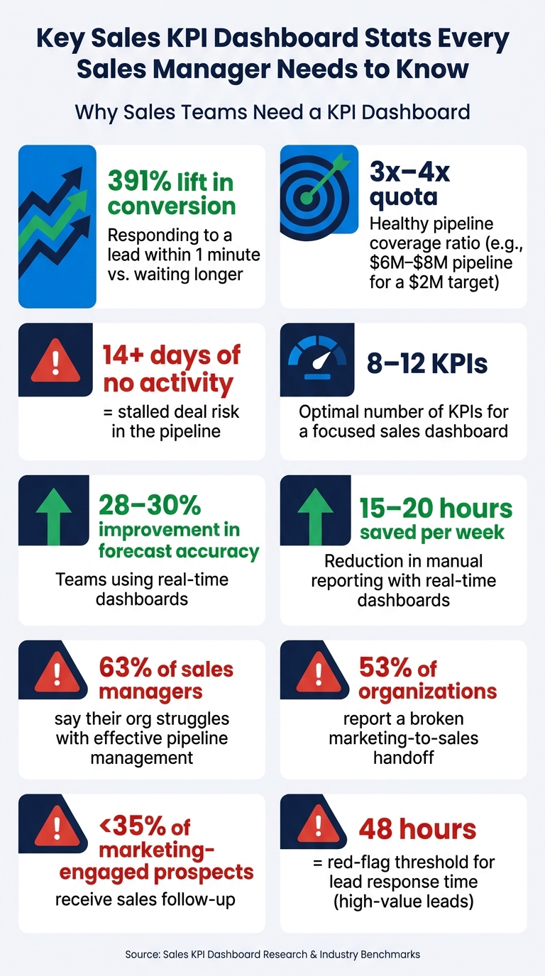
- If lead response time slips, conversion can drop fast. Responding within 1 minute can lift conversion by 391%.
- If pipeline coverage falls under 3x–4x quota, revenue risk starts to build. For a $2,000,000 target, I’d want about $6,000,000–$8,000,000 in qualified pipeline.
- If deals sit with no activity for 14+ days or stay in one stage too long, the pipeline may look healthy when it isn’t.
- If I track quota attainment, win rate, deal size, and activity-to-opportunity ratio, I can see who needs coaching and why.
- Teams using real-time dashboards can improve forecast accuracy by 28–30% and save 15–20 hours per week on manual reporting.
What this means for you is simple: a good dashboard helps you spot trouble before it hits revenue. It gives you one place to watch:
- Lead quality
- Pipeline movement
- Forecast risk
- Rep performance
The main point is not to track more numbers. It’s to track the right ones, use the same definitions across teams, and build each view around one question, like “Do we have enough pipeline for next month?” or “Who needs coaching right now?”
If I were setting this up, I’d keep it focused, role-based, and tied to decisions - not just reporting.
Key Sales KPI Dashboard Stats Every Sales Manager Needs to Know
Creating Sales KPI Dashboards in SimpleKPI
sbb-itb-8aac02d
Common Sales Challenges KPI Dashboards Address
Sales teams usually don’t have a data problem. They have a visibility problem.
The numbers live in too many places: CRM, marketing tools, finance systems, and spreadsheets. A KPI dashboard brings that data into one screen so managers can spot issues with leads, pipeline, forecasts, and team performance fast. That matters most when they need to judge lead quality, pipeline health, forecast risk, and rep output at the same time.
Just as important, dashboards help teams focus on leading signals, not only lagging results. Instead of waiting for missed targets at the end of the month, managers can watch signals like meetings booked and follow-up activity and step in earlier.
A dashboard should drive action, not just report outcomes.
What Makes a Sales KPI Dashboard Work
Before picking KPIs, decide what the dashboard needs to help managers do. The best dashboards track 8–12 KPIs, use shared definitions, and answer one clear management question.
That shared definition piece matters more than many teams expect. If sales and marketing mean different things by qualified lead, the dashboard won’t clear things up. It will muddy the water. A shared KPI dictionary, agreed on by sales, marketing, and finance, keeps the numbers trustworthy.
Each section should tie back to a real management question. For example:
- A pipeline dashboard should answer, "Do we have enough pipeline for next month?"
- A rep activity view should answer, "Who needs coaching, and on what?"
When the layout follows those questions, the dashboard feels easy to use instead of cluttered.
Users should understand the main takeaway within five seconds. Put the most important metric - quota attainment, pipeline coverage, or revenue - where the eye goes first. Then use visual alerts to flag anything that needs attention. Automated data sync helps keep the dashboard current.
With those rules in place, the dashboard can start at the top of the funnel: lead volume, speed, and quality.
Tracking Leads and Lead Quality
The hard part isn’t just getting leads. It’s knowing which leads deserve attention, how fast reps reply, and where deals start to slow down before they turn into opportunities.
That’s why it helps to track lead source performance, response time, lead quality, and conversion outcomes in one place. These are often the earliest signs that pipeline problems are starting to show.
A lead quality score blends fit and intent so reps can focus on buyers who are more likely to be ready for sales.
Lead KPIs That Show Whether Follow-Up Is Working
The most useful metrics here are lead source performance, lead response time, lead quality score, and MQL-to-SQL conversion rate.
Speed matters more than most teams think. Responding to a lead within one minute can increase conversion rates by 391%. A dashboard that shows response time by rep makes slow follow-up easy to spot. And if high-value leads sit untouched for more than 48 hours, that usually points to a stalled lead.
The MQL-to-SQL conversion rate matters just as much. When that number drops, it can mean marketing and sales are not using the same standard for what counts as a qualified lead. It can also point to weak discovery calls. That handoff problem is common: 53% of organizations report a broken hand-off between marketing and sales, and sales follows up on fewer than 35% of marketing-engaged prospects.
Comparing Lead Metrics by Stage
The table below gives benchmark ranges and red-flag thresholds for key lead metrics. Side by side, these numbers show which sources are feeding pipeline and which ones are eating up time.
| Lead Metric | Inbound Benchmark | Outbound Benchmark | Red Flag Threshold |
|---|---|---|---|
| Lead-to-Opportunity Rate | 10–15% | 1–3% | <5% (Inbound) / <1% (Outbound) |
| Speed to First Contact | <1 hour | <24 hours | >48 hours |
| Qualification Rate | 40–50% | 10–20% | Decline >15% MoM |
| Conversion Outcome | 10–15% (Lead to Opp) | 1–3% (Lead to Opp) | <5% suggests poor lead targeting |
If inbound conversion falls below 5%, that’s a strong sign of poor lead quality. It also helps to track engaged prospects that never get sales follow-up, because that exposes missed handoffs fast.
Once lead quality is clear, the next step is checking whether those leads are actually moving through the pipeline.
Managing Pipeline Visibility and Revenue Forecasting
After lead quality, the next test is simple: are opportunities moving, or are they stuck? A KPI dashboard helps you see that fast. And that's a big deal, because 63% of sales managers say their organization struggles with effective pipeline management.
Pipeline KPIs That Flag Stalled or Risky Deals
Start with the metrics that show pipeline health at a glance: qualified opportunities, total pipeline value, opportunity-to-order rate, stage aging, and sales cycle length.
One metric stands out here: stage aging. When a deal sits in the same stage for more than twice the average sales cycle length, that's a strong sign the deal is stalling. A dashboard can flag that on its own, which saves managers from digging through CRM records one by one.
The same goes for inactivity. Deals with no logged activity for 14 or more days can sit in the pipeline and make things look better than they are, even though they aren't moving toward a close.
The opportunity-to-order rate adds a rep-level view. A rep might show a big pipeline on paper, but if conversion is low, that's a coaching issue that needs attention now, not at the end of the quarter when the number misses hit.
Once stalled deals are easy to spot, the next step is forecasting.
Forecast KPIs That Support Revenue Planning
Forecast KPIs turn pipeline data into a revenue estimate. The main metrics here are target attainment, average order value (AOV), pipeline coverage ratio, forecast accuracy, and forecasted revenue.
The pipeline coverage ratio is one of the most useful. In most cases, a healthy pipeline needs to be 3x to 4x your quota to hit targets with consistency. So if your Q3 target is $2,000,000, you want at least $6,000,000 in qualified pipeline. If you're below that line, prospecting needs to speed up with a strategy for streamlining sales processes.
There's also a planning upside here: organizations using real-time dashboards have seen a 28–30% improvement in forecast accuracy.
Weighted forecasting makes the estimate more grounded than raw pipeline value alone. It assigns a close probability to each deal stage. So a deal in discovery might carry a 10% probability, while a deal in negotiation might carry 70%. That gap matters when you're planning headcount, setting budget, or deciding how hard to push at the end of the quarter.
Current Pipeline vs. Forecast View
| KPI | What It Measures | Why It Matters for Planning |
|---|---|---|
| Qualified Opportunities | Number of active, vetted deals | Shows real pipeline volume, not just lead count |
| Total Pipeline Value ($) | Dollar value of open opportunities | Sets the baseline for coverage and forecast math |
| Pipeline Coverage Ratio | Pipeline value ÷ quota | Flags revenue gaps early; target is 3x–4x quota |
| Stage Aging | Days a deal has spent in a single stage | Identifies stalled deals before they slip the quarter |
| Sales Cycle Length | Average days from first contact to close | Helps show how far ahead to forecast and when to step in |
| Forecasted Revenue ($) | Weighted pipeline value by close probability | Gives a more realistic revenue estimate for the current period |
| Target Attainment (%) | Closed revenue ÷ quota | Tracks progress toward monthly or quarterly goals in real time |
This view also makes revenue risk easier to spot. You can see where the pipeline looks full but isn't dependable, and where shortfalls are starting to build.
Using Dashboards to Manage Sales Performance
Once pipeline and forecast risk are clear, the next move is simple: figure out which reps are producing and which ones need help.
Rep and Team KPIs That Support Coaching
A dashboard helps managers tell the difference between an effort issue and a skill issue. That matters more than it may seem. A rep can look busy on the surface, but if that activity doesn’t turn into deals, the problem usually isn’t effort. On the other hand, if activity is low to begin with, that points to a very different coaching talk. Without this kind of visibility, both cases can blend together until the next review cycle.
The main coaching metrics here are quota attainment, win rate, activity-to-opportunity ratio, average deal size, upsell/cross-sell rate, and time in stage. Used together, they show where performance is holding up and where it’s slipping. For example, a rep with a high activity-to-opportunity ratio and a low win rate is likely struggling with qualification. They’re booking meetings, but they’re not screening prospects well enough. That’s a problem a manager can address right away.
Upsell and cross-sell rates also deserve close attention. They show whether reps are growing account value or chasing only new business. And time in stage can be useful too, but only when it ties back to behavior. If a rep keeps letting deals sit with no follow-up, that’s not just a pipeline issue. It’s a coaching issue.
Building a Dashboard Sales Teams Will Actually Use
Keep each dashboard view tight and tied to one job.
These KPIs work best when each role sees only the numbers it can act on. Build separate views by role:
- Reps need a daily, tactical view centered on tasks and pipeline.
- Managers need a coaching view that compares each rep’s output against team benchmarks.
- Executives need a higher-level view focused on revenue trends and forecast accuracy.
One dashboard for all three roles usually ends up serving none of them very well.
Conclusion: Better Sales Decisions Start With the Right KPIs
Once lead, pipeline, forecast, and rep visibility are fixed, the next move is consistency. A KPI dashboard swaps guesswork for clear visibility. Managers can coach reps based on what’s actually happening, not what they think is happening.
The biggest mistake? Tracking too many metrics. Most teams load their dashboards with too much data, while the best ones stick to 8–12 revenue-linked KPIs. Anything beyond that usually adds noise. Not insight. If a number hasn’t changed a single decision in the past quarter, it probably doesn’t belong on the screen. That kind of discipline turns a dashboard from a reporting page into a decision tool.
Start with the decisions your team needs to make. Then build the dashboard around those calls. Keep it focused. Keep it role-specific. Let the data speak for itself. Companies using real-time dashboards see a 28–30% improvement in forecast accuracy. That means more time spent selling and less time spent reporting. The right KPIs keep sales decisions tied to real activity, not guesswork.
FAQs
Which KPIs should I track first?
Start with five to eight KPIs that tie straight to your team’s revenue goals instead of tracking every number you can find.
A simple set might include:
- Revenue
- Pipeline coverage ratio
- Win rate
- Quota attainment
- Activity metrics, such as outreach volume and meetings booked
How often should a sales KPI dashboard be updated?
It depends on the metric.
Leading indicators, like daily call counts or pipeline movement, should update in real time or at least every day. That gives teams a chance to react fast and make changes before small issues turn into bigger ones.
Lagging indicators, like win rates or monthly revenue targets, make more sense on a weekly or monthly review cycle. They take longer to show a pattern, so checking them too often can add noise instead of clarity.
Dashboards tied to your CRM help keep data current and cut down on manual reporting.
How can I tell if my pipeline is actually healthy?
Monitor the metrics that show your pipeline’s quality and momentum. A healthy pipeline usually includes:
- 3–4x pipeline coverage vs. quota
- steady stage-to-stage conversion rates
- consistent deal velocity
You should also keep an eye on red flags like aging deals, stalled opportunities, and frequent close-date slips.